Exilior Branding
Objective
Our goal was to create a brand for the Kenyan coffee company, Exilior, that presents the company as luxurious, authentic, and caring towards the environment and towards those involved in the production of the coffee.
Pictured left: coffee beans
Logo & Mood Development
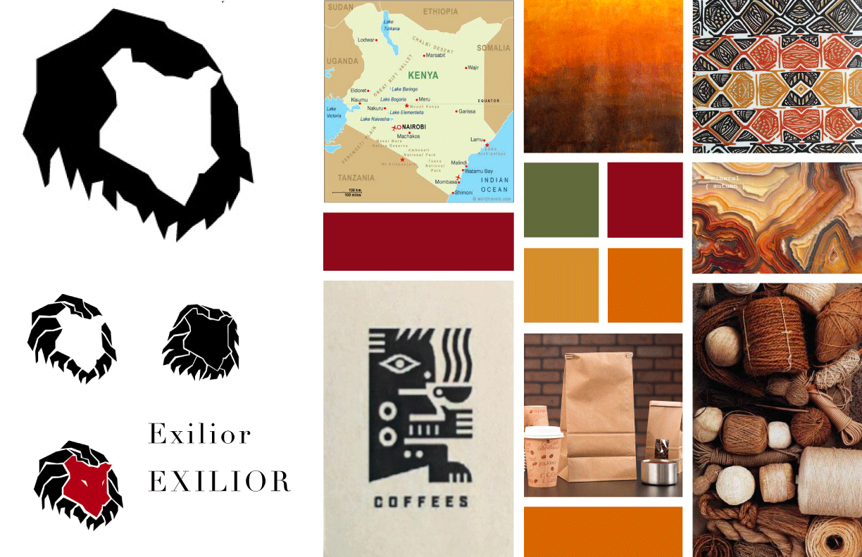
I designed a logo that incorporates a lion and uses the shape of Kenya as the lion’s head. Jaycee and I build an earthy, wood-cut print aesthetic to pair with this logo.
Pictured left: Mood board and early logos
Development
Inspired by Kenyan fabric patterns, Danny created this pattern and Jaycee applied this bag design to a mock-up, using craft as a background in order to limit future printing costs.
Pictured right: An early mockup of Exilior coffee packaging
Nearing the final solution
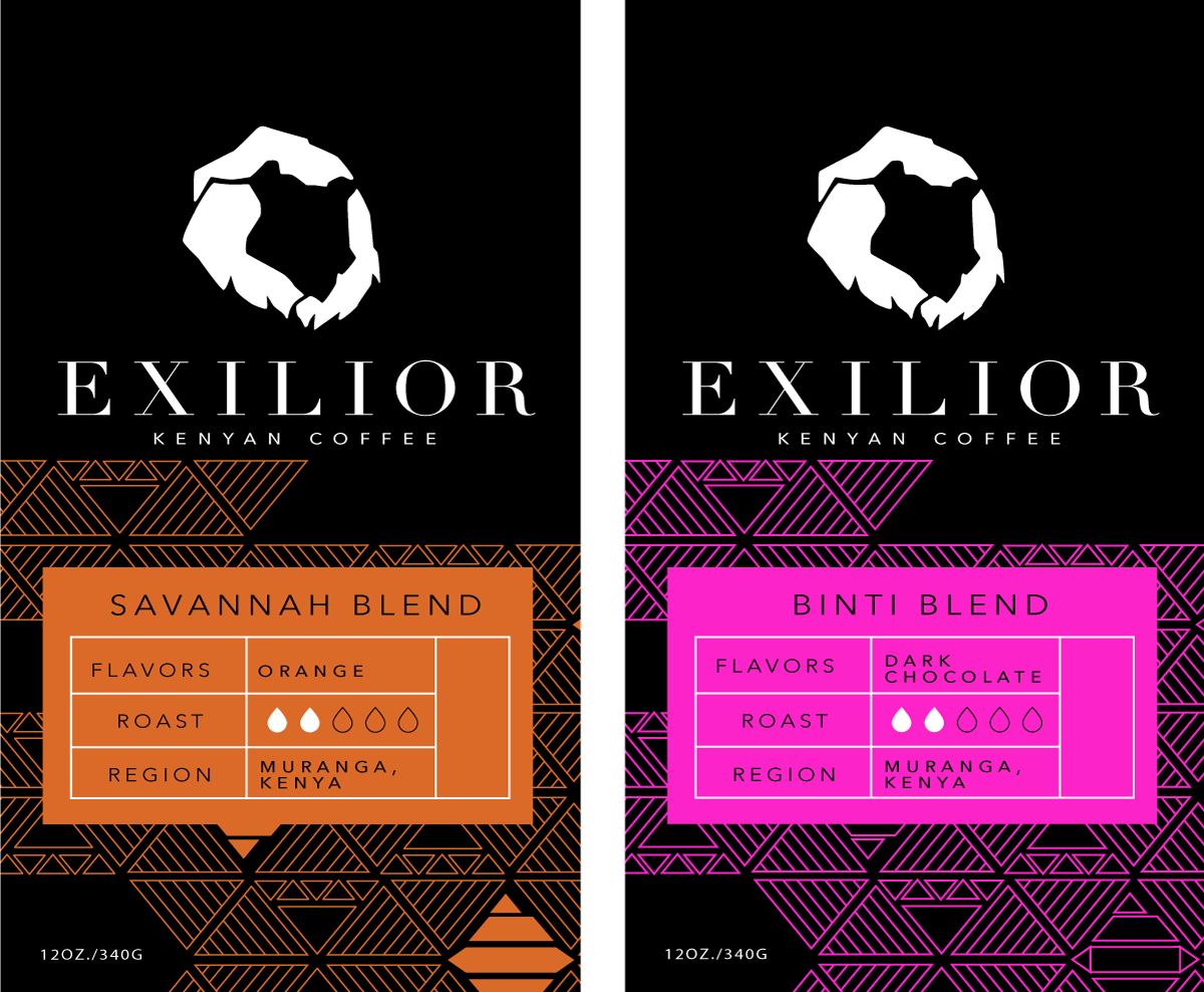
We decided to use different colors for each different blend, and keep the pattern consistent to create brand unity. The high contrast of the packaging will help set it apart from other coffee packaging at places like Market of Choice and Whole Foods, where Exilior Kenyan Coffee will be sold.
Pictured left: Nearing the final solution
final solution
Keeping with the idea of differentiating blends by color, but keeping the patterns consistent, this was the first blend produced with the final solution we eventually designed. Changes were made to allow for the craft colored background to create an earthier feel while maintaining cost efficiency.
Packaging photography by Exilior


